How did you pick the last book you bought out of the crowd?
Did you buy it at a bookstore?
Let’s say you did. What made you go for that book, specifically?
Was it a recommendation from a friend?
Was it a glowing review that convinced you that book was for you?
If so, you already had an idea of what you were looking for and you were going there to pick that one up, specifically.
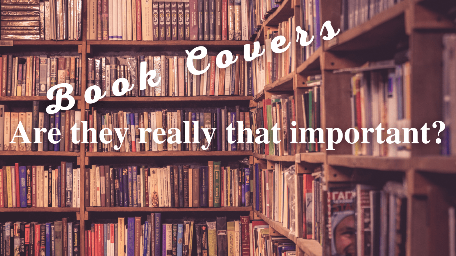
Let’s say, however, you were “just browsing” (remember those days?) at the book store, walking among the shelves filled with books in the genre you like, taking in the riot of colors and fonts on the covers, inhaling the delicious aroma of printed books. Or, on the other hand, you are at your favorite ebook supplier’s web page, hot coffee in hand, comfortable in your soft robe and slippers, again, browsing.
What drives you to a book you’ve never heard of?
What catches your attention?
The cover.
OK, OK, sometimes the title, I’ll give you that. But most times, it’s the cover that prompts you to stop and take a further look into what the book has to say for itself.
It used to be, a long time ago, the covers were monochromatic and the only thing on them was the title and author. In bold letters. That was it.
Now, it’s a whole different ball game. The cover has a clear and complicated job to do.
Let’s break it down in a non-exhaustive list.
It has to catch your eye. The cover has to grab the attention of the reader and do it in such a way as to tickle their interest to the point that they will read the title and the blurb.
How does the cover do that?
It should give an idea about when the novel was written. The cover must tell the reader if it is a contemporary novel or a classic reprint. It should tell the reader who wrote the book, and could even point out if it has won any prizes or awards.
It should give the reader a clear idea of the genre of the novel. Usually, the graphics carry the full burden. Is it an image of a dynamic, action-filled, battle scene? Is the battle between armored knights brandishing swords? Is it a space ship battle with a nebula as a background? Is it a calm, pastoral, almost lazy scene of a bucolic setting? Is it a close up of the well-defined shirtless abdomen of a very attractive man? Is it the close up of a woman’s face, ruby lips slightly parted, hair falling over the face in disarray? Is it a black and white image of a leather-clad, masked couple, one of whom is in handcuffs and the other is brandishing a whip?
Any and all of those images will tell the reader the book is for them. They will be the “usual” images associated with their preferred genre, so the reader will look at it and think “that looks interesting, like something I would enjoy”. The cover has done its job. It has informed the reader the book is for them.
Now, to get the reader to pick the book up and actually read the description, and, sometimes, even read the title, at the very least, the cover has to have certain attributes.
Is the image sharp? Well defined? Is it artistic? Is it well proportioned? Are the colors agreeable? Are they adequate for the genre? What about the font? Is it a common font used for the genre?
If the answer to all of the above is yes, in most cases, the reader feels the book is professionally made and is willing to invest time finding out what the author has to say about the story itself.
Now, lets pause for a minute.
Let’s say the images are not sharp, or in disarray, just thrown together. The lighting is conflicting, everything in the cover is casting a shadows to the left, but the shadows on the person in the cover are to the right. You have a fully festive color scheme and the novel indicates it’s a noir detective story. The title indicates it’s a children’s story and the cover has the aforementioned couple in leather and chains. That kind of dissonance or lack of consistency between the image and the content, or even bad quality of the images themselves will convey to the reader that the cover is amateurish or badly done. In many cases, that will prompt the reader to move on, not giving the book the benefit of the doubt.
So, the cover must stop the reader and grab their attention, it has to inform the reader of the genre of the book, the cover should suggest if it’s self-published or traditionally published, it should give a fairly good idea of the age group the book is for.
That’s a lot for a cover to do. And let’s not forget, it is a passive entity, it can not jump out at the reader, people have to cast their gaze around and, when it happens upon the cover, it has to do its job.
Not easy. Not easy at all for any book cover.
As authors, we all have an idea in our minds of what the cover should look like. Most of the time, we are wrong.
Why?
Well, let me tell you a little story. I made a few place holder covers for my novels. I then published them on my web page (you can see them here) and also on my Facebook page, my Twitter, and in some indie cover designer pages.
I made some that were fairly consistent. Variations on a theme. Those came back with terrible comments. People criticized the quality of homemade, rough, not for publication covers. I was testing the concepts, they were concentrating and commenting on my skills (real or imaginary).
I quickly learned that I should tell people what I wanted, and show them. Make different covers. Completely different. Some had no humans in it. Some had a full person on it. Some only had a hand. Now we got somewhere. People started telling me what each cover said to them, what message was getting through. Most times, the one I liked the best, was not the one that people liked. Or the one that would motivate them to buy the book.
You see, I knew what the book said. The whole thing. All the details and the backstories. The reader, those people looking at the cover, have no idea about any of that. They will not hold it against you if the “scene” on the cover is not actually in the book. As long as the book is good, of course, but that’s another story. They want to be enticed, seduced, attracted, to the book. Then, the blurb should do the rest of the work. Now, if your blurb messes that up, then you’ll have some angry readers on your hands. But, I digress.
The cover has to be well made. Ideally, get a professional to make your covers. If you are a graphic designer and have experience in making book covers, have at it. If not, invest in the cover. Is the best you can do for your book. You are giving it the best possible chance to catch the eye of the reader.
Let me give you a couple of examples of how things can go wrong.
You finished your novel and you follow the advice, often given, to take a look at all the other covers in your genre and sub-genre. Then you see it. They all have many elements in common. AHA! You can make a cover that, while very much relevant to your book, will have none of those. It will be different and it will stand out. Great! Now you got something! OK, I’m going to borrow a crude but very descriptive and effective phrase from one of Derek Murphy’s YouTube videos: Your book will be a “dildo in the cereal section”. Yes, it’ll be different. Yes, it’ll stand out. And, absolutely, yes, there will be those that will pick it because it is so different. And because of curiosity, needs, tendencies… Any way. Most readers, though, will figure it’s a misclassified book and move on, never giving it a chance. While it should not be such a generic cover that it is exactly the same as all the others, or, even worse, the same cover as another book (it happens), it should fit comfortably in the ecosystem of your genre.
Another problem that may arise is the infamous “protagonist scene” cover. You, the author, have an absolutely great scene. It’s early in the book, so it helps set up the story. So, the castle is on top of the hill, the vast army of the shiny armor knights are ready to battle the green ogre army coming down from the dark forest, riding on their trained bloodthirsty wolves. The rich details will tell a lot of the story. The shining armors, with their emblems and trailing ribbons, each color indicating the clan the knight comes from, the number of ribbons indicating the number of battles the knight has been in, the jewels on the pummel of the swords bearing witness of the knights wealth. And, of course, the wolfs must have bloody fangs showing, along with the different color pelts, the grays, the blacks, the whites, the browns, the yellows, and, naturally, the eye color determines their magic power. The weapons of the ogres show if they are mountain ogre, armed with stone-encrusted wooden clubs, the desert ogre with their hardened bone clubs, and so on. Stellar, right? So the author sends the artist the scene. “That’s what I want on the cover.”
Don’t get me wrong. It can be done, but it will be hard and if one of the versions of the book is an ebook, the cover will be first presented to the reader as a thumbnail image. The titanic battle will be so small, so busy, that the reader might simply skip it. Just because there is a great scene in your book, that doesn’t necessarily mean it must be on the cover.
There is another important detail regarding covers.
You see, in our modern world, let us say you are an indie author and chose to make your book available as ebook and print. The ebook cover is a relatively simple affair as far as size and characteristics. You will receive from the web page where you are going to publish the details regarding size and such. How tall. How wide. How many pixels. What definition. In general, we can all fake it enough that it’ll come out OK, not good, but acceptable-ish. But, when you go to the side of the printed book, well, that’s a whole different thing. You need the word count, so you can determine how wide the spine will be, but, that will also depend on the physical size of the book. Is it a small paperback? A medium-size? A hardback? Is it a hardback cover print or does it have a dust cover? Trust me, the money invested in getting a graphic artist to deal with all that will be well spent.
This post came about because I just received the absolutely stellar book cover (SciFi genre, see what I did there?) Clarissa Kezen (ckbookcoverdesigns.com, Twitter.com/ckbookcovers) did for me.
As I indicated before, I tested out several designs and sent her a few ideas. She proceeded to get the right font, add the small details that bring it to professional-grade, and polish what I think is a beautiful cover for my debut novel.
I will probably publish in 2021, because of different circumstances in my life right now.
So, look forward to the cover reveal sometime early next year.
Thanks for taking the time to read this post. Do you have any questions? Any comments? Please, leave them here and I’ll gladly get back to you.
Have a terrific day.

I agree. especially in today’s visual centric society the cover is extremely important. It is the first thing that we notice. The cover, then title, then author. But if that cover isn’t top notch there’s no way I’m picking it up no matter… unless the book is written by an already prominent author or recommended by a friend.
LikeLike
Thanks so much for the comment. Appreciate it.
LikeLiked by 1 person